World of Salus
World of Salus is an in-browser medical training eLearning game developed for nurses new to the Mercy Hospital system in Baltimore, Maryland.
Project
eLearning Training Game
Role
Lead UX/UI Designer, Assistant UX Researcher
Tools
Sketch, Photoshop, Illustrator
Project Overview
Job training course material can be very dry. Many employees skip the content if possible and go straight to knowledge checks, missing vital information. Noticing the low engagement rates of existing course material, an eLearning team at Mercy Hospital wanted to turn an existing course into an interactive experience. I was brought on to the project by Brinkbit Inc. as Lead UX/UI Designer. At Binkbit I worked with a team consisting of a full-stack developer, a front-end developer, a game designer, and a project manager.
Objective
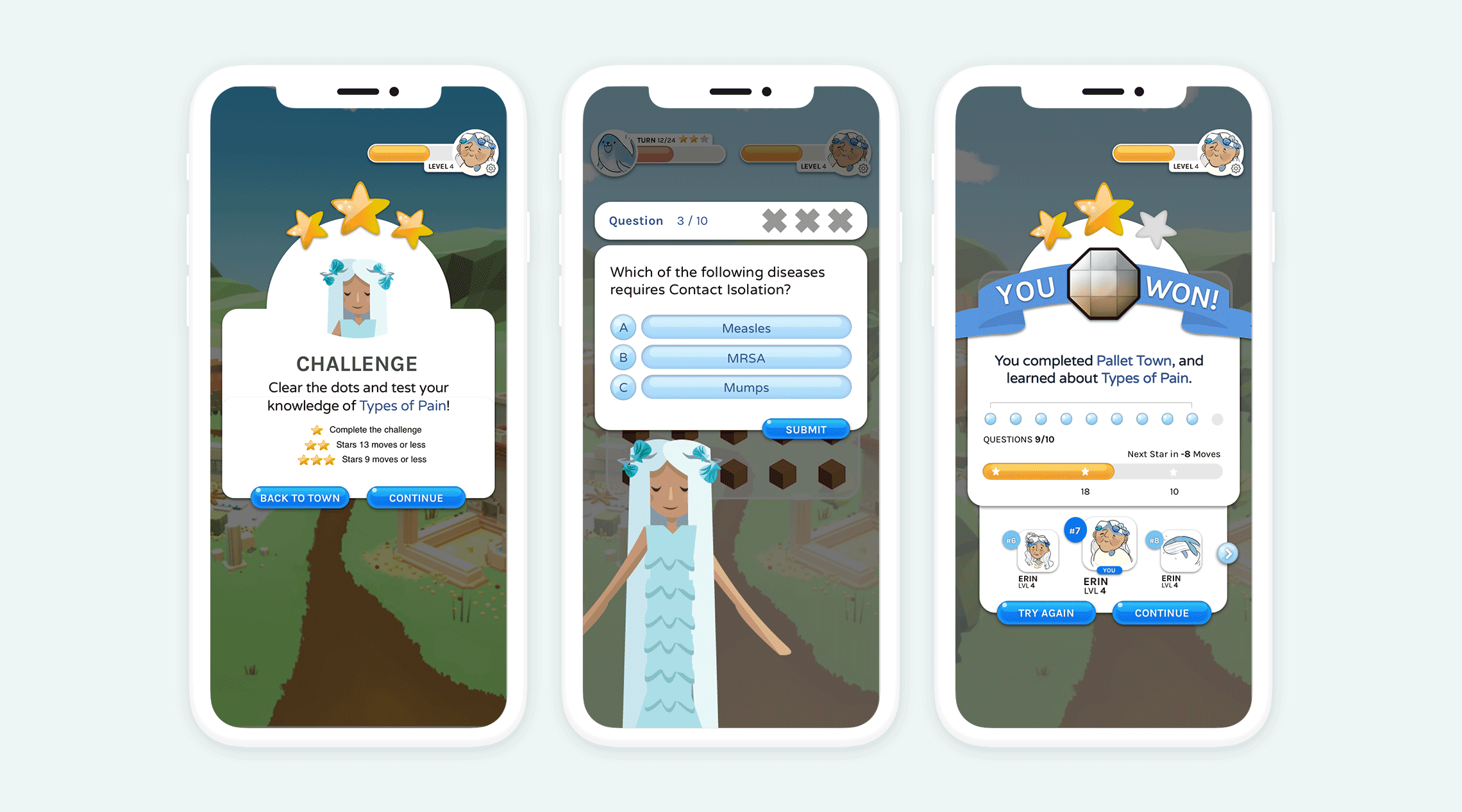
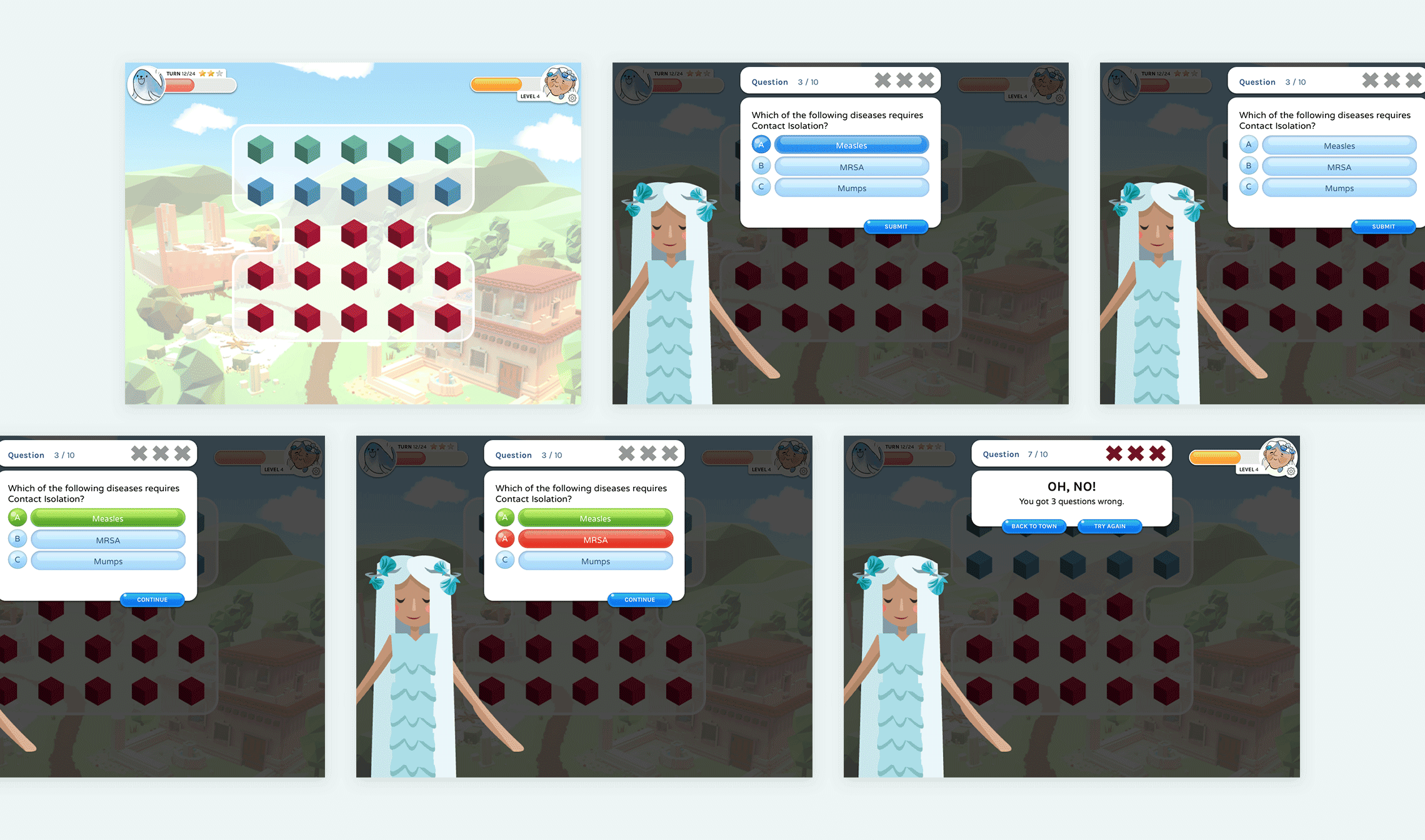
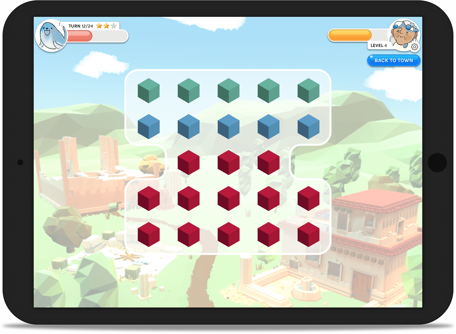
- Create a fun and engaging fantasy quest that also presents important medical instructional material
- Incorporate mini-games, knowledge checks, a leaderboard, and character customization
Scope of Work
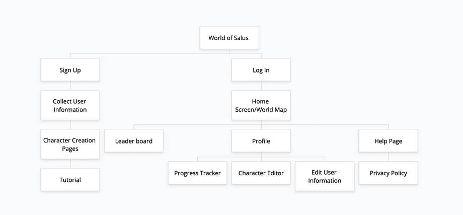
Create a site map of proposed content, incorporated Mercy Hospital feedback and competitor research, UX research on similar games, proposed wireframes, and final design for development.
KPIs
- Engagement levels: users must land on each lesson screen and complete the course material, mini-games can be skipped, but users must pass each quiz or knowledge check (a score of 80 out of 100 or higher)
- Time spent: more than 5mins per screen and less than 20mins. This would indicate that the user is engaged but the material is not too challenging
- Complete the entire course within 6 weeks
Competitors
LeapFrog
- For youth audience
- Cannot customize course material
- Myriad of minigames to immerse the user in the instructional material
Mercy eLearning courses
- Dry slide shows with narration
- Can often click through quickly without processing the instructional material
- Quiz at the end of each section
2 Dots
- Lively animation gives user positive feedback, giving the satisfaction of success
- The HUD is informative to what needs to be done and what has been done
- Large, clearly defined messages
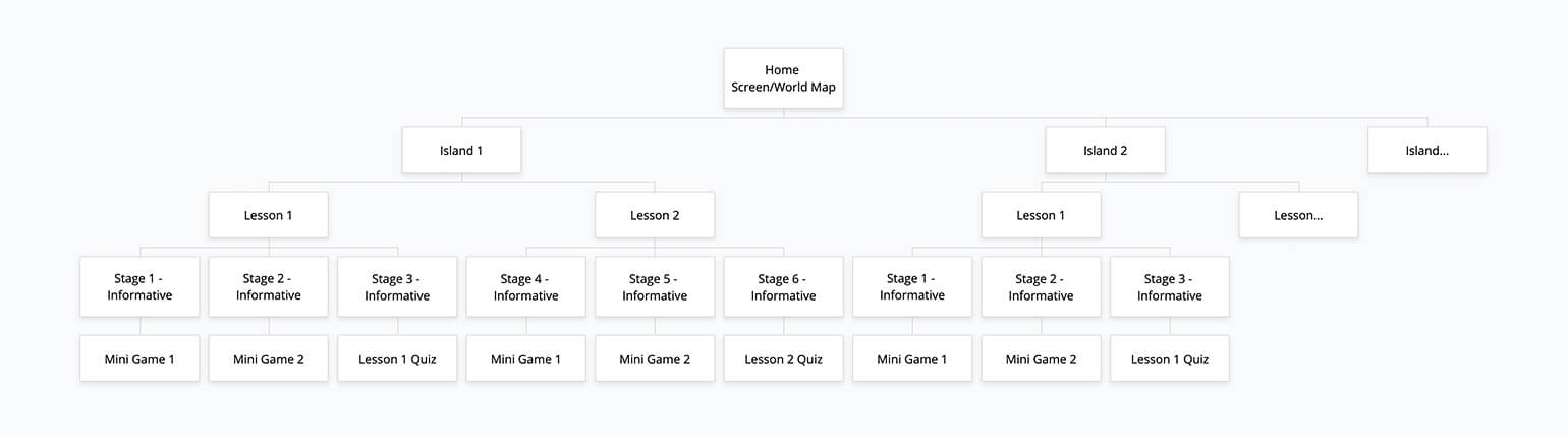
Site Map
Proprietary content has been edited and abbreviated.
User Task Analysis
User goals
- Complete required course work
- Pass knowledge assessments
How users access the course
- The web app initially was only available as a bookmark shortcut on company iPads during work hours
- Users wished to use their own devices to access and complete content at their leisure
What users actually do
- In the MVP all content was accessible from the beginning. Users jumped around to different lessons, played entertaining games, and did not complete content in order
Design Considerations
- To increase accessibility and decrease development time, it was determined that this experience should be a password-locked web app
- To account for different screen sizes Brinkbit decided to create a square safe content area
- It was determined that gatekeeping users from future content allowed them to focus on the current section they were on, which allowed for the user to spend more time on the content and do deep dives into the topic in front of them
Final Designs